What do you think of the headshot?
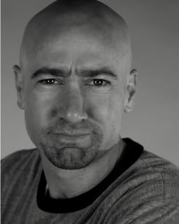
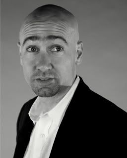
I had headshots taken a couple weeks ago. Out of 50 or so pictures, I came down to two I really liked, one of which is to the right, as well as below.

Ish #1: Bemused, wry, sarcastic.
Some people think I appear to be scowling in this photo. I'm not, really. It's more a look of bemusement, with a hint of a smile; like I just made some witty, sarcastic remark. At least that's what I see.
The other one (below), has more of a sense of whimsy, I think. Maybe I seem a little more likeable or approachable. But on the other hand, maybe it doesn't make as strong an impression as the other one.

Ish #2: Whimsical, approachable
Which one do you prefer?


57 Comments:
Honestly, I do not like either one and here is why:
1) the first IS more scowl than bemusement. It just does NOT look like you just said something ironic at all.
2) the second is more whimsical, but also a little bit too goofy w/ the raised eyebrows. It is more memorable though. This one just screams out "I am trying to be a professional funny person"
Is it ok for a comic to have a headshot where you look attrative? I mean just because you are a comic, must you have a goofy photo?
(I am being sincere, not snotty. don't take any offense. I mean I implied you could be attractive ;)
I like the picture on the bottom. Bye Bye
CWC
I am leaning toward the dangerously insane photo.
Bye
KAC
I like the top one. The bottom one looks a little to "clown" vs. "comic" to me...
Plus I had an ex who would make a scowl/bemused/smirking look like the top one anytime he attempted to be funny - which always made me laugh (even if the joke did not).
And the bottom one is the more attractive of the two. Not that attraction is the MOST important thing... But... Well, you know.
:)
well, i've already said i like the one on top better. i get the bemusement and i think it's a cute shot of your face (and you can almost tell how blue your eyes are). it also comes across as self-assured.
i don't like the shadows on your head in the bottom one, and i think the expression suggests you're saying something you're not sure of. like you've just asked, "is that funny?"
Well..since you asked...I never have cared much for #1 since you put it up. I agree with kirin..it looks "scowly". #2 is kinda cute but goofy but at least better than the scowl. I'm just sayin is all...
IIFin Fresno
I definitely like #1 better -- stronger personality. The thought bubble I imagine over your head is, "Hmm ..." as if you're mulling over something someone's just said to you while you keep intense eye contact. If it's a scowl, it's one of an intelligent person's concentration; not unfriendly. But I don't get the bemusement aspect, though. ;o)
Um, k: it's a black and white photo. There is no way in hell you can tell his eyes are blue. You are using existing knowledge to evaluate these photos - which is not how they will be evaluated by strangers.
kirin,
it's totally true, i am using what i know of him to evaluate the pictures, but i can't help that. i don't think it's making my judgment any less valid. i think the first one reflects his personality better.
and re: blue eyes: yes, of course they are b&w shots but i like the clarity of his eyes in the top one better.
k -
your original post said "(and you can almost tell how blue your eyes are). " no mention of clarity the first time.
and let's just say that your comments are not valid because you are his girlfriend. I just made that up as a rule for this one posting only, since ish is obviously busy working, or engaged in some other time-wasting effort :)
I vote for Ish #1. It says to me, I have wicked sense of humor.
i like them both....but when i make the face you're making in the first one, it gives me a headache. you look more comfortable in the 2nd one! = )
You're not going to like this, Ish, and frankly, I have no idea what makes for a good commedic head shot and these are clearly professional quality, but I don't think either one is what you want. Number 1 is very attractive, but doesn't make me think "comic." Number 2 says "comic," but staged. I've never seen your act, so I don't know what type of humor you do, but your head shot should prepare me for that. Just some thoughts. For what they're worth.
i'm assuming you just want a general opinion on which photo looks better and it has nothing to do with you being a 'comic'...
i think both photos are quite nice, --
the first one has an intelligent and serious look to it...confident and self-assured, as somebody said...non-approachable, maybe yes...but that only makes it all the more interesting!
in the second one too, you look pretty great, but you have an overly-obvious 'am being funny' look ...
i prefer the first one! :)
--Syl
The first one looks more like a mugger than a comedian, and the second one is funnier, but I'm not sure about the white shirt and jacket.
I like the first one. If you look at it long enough you can detect a hint of smile.
I like the first one. If you look at it long enough you can detect a hint of smile.
#2 is more memorable to me. stark if you will. I like your expression in the first, but something about it just isn't as striking.
the second one seems to stay with me... makes me want to head out to a comedy club to see what you're really like.
just my $0.02, not that it's even always worth that. good luck with the decision.
maybe it's just my p-ness, (and we know k can be very jealous of our p-ness-es,) but...
I want more to choose from!!!
as a person who does this for a living (critique photos), first off, the print is bad on #1. try to get it reprinted. there should be more contrast between the b/w and instead it's just a sea of grey it is now.
I like the expression you have on #1 but the overall composition is better on #2 and #2 is technically a better photo (but I hate #2).
Why it's a better photo...better contrast wt the b/w ensemble you're wearing. Also, there's a nice clean line from lower left to upper right corner the eye follows thanks to the white shirt which "ends" at your face.
so ya got the proof sheet? would love to see other options with the 2nd outfit on.
Hi,
I don't really care for either of those shots either.. you do look kind of "mean" in the first shot, and the other one makes me think you just got a wedgie...
I think it's something about the "darkness" of your face, with the dark eyes and everything, the beard thing just makes you look a little sinister.. just my two cents.
Mia
I like the first one best. I read you as bemused and not as scowling. The second one does look more like "I'm trying hard to look funny".
First one definitely!!!
I like #1 for a head shot, but I think you have a ton more character in #2. There you have it.
The first one is very sex-ay. Great eyes. But a more natural face would be good also.
I like the composition of #2... but much prefer the expression in #1. I definitely see the bemusement in that one. And as someone else pointed out, #2 looks a little too staged.
#1 makes you look like you're going to kill someone in a cabin in the woods.
#2 makes you look like someone just surprised you by sticking something up your ass.
Do we have any other choices?
If I had to pick one of these, I'd say #1 though.
Of course, not knowing you in real life and how the pictures represent your personality, I'll tell you what I see in both. In the first pic, it looks like you're saying, 'wtf are you talking about, idiot?'. The second one is a little too clowny. Too obvious for a comedian. Sorry.
Search for the subtle ground between both of those and I think you'll have a winner though.
Between the two photos I can see enough of you to tell you're a nice looking man. However, neither photo does you justice. I think that you need another one, along the lines of #1 but the clearer lighting of #2.
You don't look 'scowly' in #1, just serious, intent. Is that the look you're seeking?
Thanks for asking. Good luck in making sense of all the comments :-)
Ish,
you need to pick the one that you think portrays you the best. A bunch of strangers tellin ya will not work. Then again I like #1 better than 2.
neither is a bad shot...
but i don't think either is the right one.
sorry?
First picture is great. You're eyes look right at the viewer and "own" what you're thinking. You don't look like you're scowling. You look confident and adult. I see a twinkle. Don't you?
It depends on what you're going for.
The first one screams "I'm hot and fuckable"
The 2nd suggests you're a comedian.
Is there a 3rd option combining the two?
I much prefer #1 - way more interesting & the forehead wrinkles don't work for me in #2.
How about having your eyebrows land somewhere between sorta menacing and could be a doofus? In the first photo, you look like a bouncer. In the second, you appear scared of the camera. However, the composition and clarity and of the latter are vastly superior. I vote for back to the drawing board.
not knowing you at all, i have to admit that in the first one you look a little constipated... that sounds awful, but i really don't know you, so it's not personal.
I like both, but I'm not keen on how the top one was cropped giving your head a flat top.
The bottom one has a nice composition to it and the stark black white at the bottom is a nice touch.
I'm sorry, but if you're smiling bemusedly in that first photo, you may want to give botox a try.
I agree with the photog - the outfit for the second one is better. More proofs from that batch needed.
i don't see a scowl at all in the first one. but i do still like the second one better. i'm just sayin.
#2
#2
#2
#1 seems intimidating.
#2 makes you look like a Klingon.
OK, so the first one looks like you'd make a great detective in one of those mystery/suspense movies. The second is better for a funny theme, but I'm not sure it's entirely the look you want. Definitely more memorable, but you look like you'd be great in a funny kids' movie.
the top one. it's hot. #2 just is silly.
The top one looks like it should go on a bookjacket. I think the second is better for a simple comedic headshot. Save the other for when you decide to start publishing...(if you ever do, I seem to remember hearing something about comedic writing in the past).
I like the first one.
I think u need to go back to your proof sheet.
In 1 you look less bemused and more confused.
In 2 you look more like an I-love-myself Hollywood wannabe, not a guy people want to go see to make them laugh.
Not trying to nasty, just honest, which I presume is what you're going for here?
I like the top one much better. If there was one thing I would change about it, it would be to soften up the brow furrowing just a bit. I can see why she walks is dating this blog.
good luck with the pics.
The main problem definitely lies with the eyebrows. Too low = scowling. Too high = goofy. Do you have some proofs where your eyebrows are just, well, normal?
I agree, neither. I think you're an attractive guy, but neither picture shows you off very well.
The first one is definitely too scowly. (Ever considered Botox?)
And the 2nd one looks like you just learned your car got towed.
Maybe we could see a few of the other 48 and vote again.
TOP.
#2 is cheesy.
You don't need my opinion as the general prevailing opinion is exactly what I think, but I DON'T agree that it depends on what kind of comedy you do. Just get one of you plain and smiling! I think it's awfully cheesy and forced to get a head shot based on your act--won't your act change over time? All the professional comics I've seen have the standard head shots with no reference to their acts whatsoever. Except maybe Carrot Top. And tell me you don't want to emulate Carrot Top, no matter how ripped he may be.
Also, I really like the white shirt and black jacket--classy!
I don't know if this has been said or not as I didn't have time to read through the other 56 comments but...
How about one with only one eyebrow raised?
I think I prefer the second one but again, one eyebrow raised not both. Too many speedbumps on your forehead. I have a prominant forehead although I am not losing my hair, nor do I shave my head, and I've found the 'one eyebrow raise' to be quite effective in communicating many things.
Just my opinion though.
The top one is the better photo clearly. Having said that your expression seems to be saying to me:
"What are you, some sort of idiot?"
Just one man's take. You should post some of the others.
Ish - I think they're both great. I kind of disagree with what Aarwenn said, though. I think that you should choose the one that fits your act the best. From a marketing perspective, you want to set the appropriate expectation with your audience. You'll draw more of the kind of audience you want and they'll leave more satisfied.
I like the first one in a carlin-meets-sienfeld "I'm one sarcastic bastard" kind of way. I like the other in a more "loveable goofball" kind of way. Personally, I enjoy the former category of comedy better, so I'd be more inclined to go to one of your shows after seeing that pic.
I vote for number two...
I prefer whimsical, but I'm can't hire you to do anything. Whimsical might be too much like a resume on pink paper with kittens on it. Picture 1 is, of course, more conventional and doesn't show much personality, but it's still good. Is there a third option between the two/
Definitely #1. Number two says, "I'm zany." Which is pretty much like saying, "I'm not funny." Not the right message, because I am sure you are funny.
i'm not getting the bemusement in #1. and i agree with photo critique lady, more contrast and you are too close. i actually think your eyes look way too beady in #1.
i like the second one better but i am not a fan of either really.
#2 reminds me of dave attell whom i adore.
if it were a flier, i would say no to #1 and maybe to #2.
there's my two cents. thanks for asking i love giving my opinion.
First, I think you're cute.
I like #1, but maybe you can have a really good PhotoShopper get rid of the frown. that way you wouldn't have to redo the shots.
Post a Comment
<< Home